Bootstrap4 菜鸟教程
- Bootstrap4 教程
- Bootstrap4 安装使用
- Bootstrap4 网格系统
- Bootstrap4 文字排版
- Bootstrap4 颜色
- Bootstrap4 表格
- Bootstrap4 图像形状
- Bootstrap4 Jumbotron
- Bootstrap4 信息提示框
- Bootstrap4 按钮
- Bootstrap4 按钮组
- Bootstrap4 徽章
- Bootstrap4 进度条
- Bootstrap4 分页
- Bootstrap4 列表组
- Bootstrap4 卡片
- Bootstrap4 下拉菜单
- Bootstrap4 折叠
- Bootstrap4 导航
- Bootstrap4 导航栏
- Bootstrap4 面包屑导航
- Bootstrap4 表单
- Bootstrap4 表单控件
- Bootstrap4 输入框组
- Bootstrap4 自定义表单
- Bootstrap4 轮播
- Bootstrap4 模态框
- Bootstrap4 提示框
- Bootstrap4 弹出框
- Bootstrap4 滚动监听
- Bootstrap4 小工具
- Bootstrap4 Flex 布局
- Bootstrap4 多媒体对象
Bootstrap4 信息提示框
Bootstrap 4 可以很容易实现信息提示框。
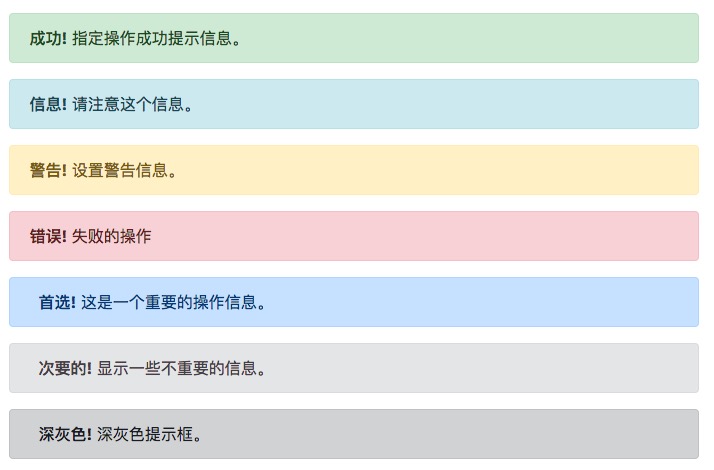
提示框可以使用 .alert 类, 后面加上 .alert-success, .alert-info, .alert-warning, .alert-danger, .alert-primary, .alert-secondary, .alert-light 或 .alert-dark 类来实现:
<!DOCTYPE html>
<html>
<head>
  <title>Bootstrap 示例</title>
  <meta charset="utf-8">
  <meta name="viewport" content="width=device-width, initial-scale=1">
  <link rel="stylesheet" href="https://cdn.staticfile.org/twitter-bootstrap/4.3.1/css/bootstrap.min.css">
  <script src="https://cdn.staticfile.org/jquery/3.2.1/jquery.min.js"></script>
  <script src="https://cdn.staticfile.org/popper.js/1.15.0/umd/popper.min.js"></script>
  <script src="https://cdn.staticfile.org/twitter-bootstrap/4.3.1/js/bootstrap.min.js"></script>
</head>
<body>
<div class="container">
  <h2>提示框</h2>
  <p>提示框可以使用 .alert 类, 后面加上指定特定意义的颜色类来实现:</p>
  <div class="alert alert-success">
    <strong>成功!</strong> 指定操作成功提示信息。
  </div>
  <div class="alert alert-info">
    <strong>信息!</strong> 请注意这个信息。
  </div>
  <div class="alert alert-warning">
    <strong>警告!</strong> 设置警告信息。
  </div>
  <div class="alert alert-danger">
    <strong>错误!</strong> 失败的操作
  </div>
  <div class="alert alert-primary">
    <strong>首选!</strong> 这是一个重要的操作信息。
  </div>
  <div class="alert alert-secondary">
    <strong>次要的!</strong> 显示一些不重要的信息。
  </div>
  <div class="alert alert-dark">
    <strong>深灰色!</strong> 深灰色提示框。
  </div>
  <div class="alert alert-light">
    <strong>浅灰色!</strong>浅灰色提示框。
  </div>
</div>
</body>
</html>
测试看看 ‹/›
提示框添加链接
提示框中在链接的标签上添加 alert-link 类来设置匹配提示框颜色的链接:
<!DOCTYPE html>
<html>
<head>
  <title>Bootstrap 示例</title>
  <meta charset="utf-8">
  <meta name="viewport" content="width=device-width, initial-scale=1">
  <link rel="stylesheet" href="https://cdn.staticfile.org/twitter-bootstrap/4.3.1/css/bootstrap.min.css">
  <script src="https://cdn.staticfile.org/jquery/3.2.1/jquery.min.js"></script>
  <script src="https://cdn.staticfile.org/popper.js/1.15.0/umd/popper.min.js"></script>
  <script src="https://cdn.staticfile.org/twitter-bootstrap/4.3.1/js/bootstrap.min.js"></script>
</head>
<body>
<div class="container">
  <h2>提示框添加链接</h2>
  <p>提示框中在链接的标签上添加 alert-link 类来设置匹配提示框颜色的链接:</p>
  <div class="alert alert-success">
    <strong>成功!</strong> 你应该认真阅读 <a href="#" class="alert-link">这条信息</a>。
  </div>
  <div class="alert alert-info">
    <strong>信息!</strong> 你应该认真阅读 <a href="#" class="alert-link">这条信息</a>。
  </div>
  <div class="alert alert-warning">
    <strong>警告!</strong> 你应该认真阅读 <a href="#" class="alert-link">这条信息</a>。
  </div>
  <div class="alert alert-danger">
    <strong>错误!</strong> 你应该认真阅读 <a href="#" class="alert-link">这条信息</a>。
  </div>
  <div class="alert alert-primary">
    <strong>首选!</strong> 你应该认真阅读 <a href="#" class="alert-link">这条信息</a>。
  </div>
  <div class="alert alert-secondary">
    <strong>次要的!</strong> 你应该认真阅读 <a href="#" class="alert-link">这条信息</a>。
  </div>
  <div class="alert alert-dark">
    <strong>深灰色!</strong>你应该认真阅读 <a href="#" class="alert-link">这条信息</a>。
  </div>
  <div class="alert alert-light">
    <strong>灰色!</strong> 你应该认真阅读 <a href="#" class="alert-link">这条信息</a>。
  </div>
</div>
</body>
</html>
测试看看 ‹/›
关闭提示框
我们可以在提示框中的 div 中添加 .alert-dismissible 类,然后在关闭按钮的链接上添加 和 data-dismiss="alert" 类来设置提示框的关闭操作。
<!DOCTYPE html> <html> <head> <title>Bootstrap 示例</title> <meta charset="utf-8"> <meta name="viewport" content="width=device-width, initial-scale=1"> <link rel="stylesheet" href="https://cdn.staticfile.org/twitter-bootstrap/4.1.0/css/bootstrap.min.css"> <script src="https://cdn.staticfile.org/jquery/3.2.1/jquery.min.js"></script> <script src="https://cdn.staticfile.org/popper.js/1.12.5/umd/popper.min.js"></script> <script src="https://cdn.staticfile.org/twitter-bootstrap/4.1.0/js/bootstrap.min.js"></script> </head> <body> <div class="container"> <h2>关闭提示框</h2> <p>我们可以在提示框中的 div 中添加 .alert-dismissible 类,然后在关闭按钮的链接上添加 class="close" 和 data-dismiss="alert" 类来设置提示框的关闭操作。</p> <div class="alert alert-success alert-dismissible"> <button type="button" class="close" data-dismiss="alert">×</button> <strong>成功!</strong> 指定操作成功提示信息。 </div> <div class="alert alert-info alert-dismissible"> <button type="button" class="close" data-dismiss="alert">×</button> <strong>信息!</strong> 请注意这个信息。 </div> <div class="alert alert-warning alert-dismissible"> <button type="button" class="close" data-dismiss="alert">×</button> <strong>警告!</strong> 设置警告信息。 </div> <div class="alert alert-danger alert-dismissible"> <button type="button" class="close" data-dismiss="alert">×</button> <strong>错误!</strong> 失败的操作。 </div> <div class="alert alert-primary alert-dismissible"> <button type="button" class="close" data-dismiss="alert">×</button> <strong>首选!</strong> 这是一个重要的操作信息。 </div> <div class="alert alert-secondary alert-dismissible"> <button type="button" class="close" data-dismiss="alert">×</button> <strong>次要的!</strong> 显示一些不重要的信息。 </div> <div class="alert alert-dark alert-dismissible"> <button type="button" class="close" data-dismiss="alert">×</button> <strong>深灰色!</strong> 深灰色提示框。 </div> <div class="alert alert-light alert-dismissible"> <button type="button" class="close" data-dismiss="alert">×</button> <strong>浅灰色!</strong>浅灰色提示框。 </div> </div> </body> </html>测试看看 ‹/›
提示: × (×) 是 HTML 实体字符,来表示关闭操作,而不是字母 "x"。
提示框动画
.fade 和 .show 类用于设置提示框在关闭时的淡出和淡入效果:
<!DOCTYPE html> <html> <head> <title>Bootstrap 示例</title> <meta charset="utf-8"> <meta name="viewport" content="width=device-width, initial-scale=1"> <link rel="stylesheet" href="https://cdn.staticfile.org/twitter-bootstrap/4.1.0/css/bootstrap.min.css"> <script src="https://cdn.staticfile.org/jquery/3.2.1/jquery.min.js"></script> <script src="https://cdn.staticfile.org/popper.js/1.12.5/umd/popper.min.js"></script> <script src="https://cdn.staticfile.org/twitter-bootstrap/4.1.0/js/bootstrap.min.js"></script> </head> <body> <div class="container"> <h2>提示框动画</h2> <p>.fade 和 .show 类用于设置提示框在关闭时的淡出和淡入效果:</p> <div class="alert alert-success alert-dismissible fade show"> <button type="button" class="close" data-dismiss="alert">×</button> <strong>成功!</strong> 指定操作成功提示信息。 </div> <div class="alert alert-info alert-dismissible fade show"> <button type="button" class="close" data-dismiss="alert">×</button> <strong>信息!</strong> 请注意这个信息。 </div> <div class="alert alert-warning alert-dismissible fade show"> <button type="button" class="close" data-dismiss="alert">×</button> <strong>警告!</strong> 设置警告信息。 </div> <div class="alert alert-danger alert-dismissible fade show"> <button type="button" class="close" data-dismiss="alert">×</button> <strong>错误!</strong> 失败的操作。 </div> <div class="alert alert-primary alert-dismissible fade show"> <button type="button" class="close" data-dismiss="alert">×</button> <strong>首选!</strong> 这是一个重要的操作信息。 </div> <div class="alert alert-secondary alert-dismissible fade show"> <button type="button" class="close" data-dismiss="alert">×</button> <strong>次要的!</strong> 显示一些不重要的信息。 </div> <div class="alert alert-dark alert-dismissible fade show"> <button type="button" class="close" data-dismiss="alert">×</button> <strong>深灰色!</strong> 深灰色提示框。 </div> <div class="alert alert-light alert-dismissible fade show"> <button type="button" class="close" data-dismiss="alert">×</button> <strong>浅灰色!</strong>浅灰色提示框。 </div> </div> </body> </html>测试看看 ‹/›